

We’d love to make you our next success story. Complete our brief survey to get started on your marketing journey!
Space Coast
Their botanical blends are a testament to their dedication to excellence.
Overview
Project Overview
Space Coast approached us to create a complete visual identity for a new consumer brand, beginning with the logo and expanding into packaging, apparel, promotional merchandise, and campaign imagery. The client came into the process with an open mind and gave us the freedom to explore a wide range of creative directions.
The Challenge
The goal was to develop a brand that felt original, memorable, and capable of standing out in a competitive marketplace. Because the client had not yet committed to a particular visual direction, the identity needed to be built from the ground up while remaining flexible enough to work across packaging, digital marketing, merchandise, and future product extensions.
Research & Strategy
We began with extensive category and competitive research to understand how similar brands were positioning themselves. We reviewed packaging trends, color palettes, typography, visual storytelling, and the ways competitors were using lifestyle imagery to connect with their audiences.
That research helped identify an opportunity to create something more immersive and concept-driven. Rather than relying on familiar category conventions, we developed several distinct identity directions for the client to consider.
Creative Development
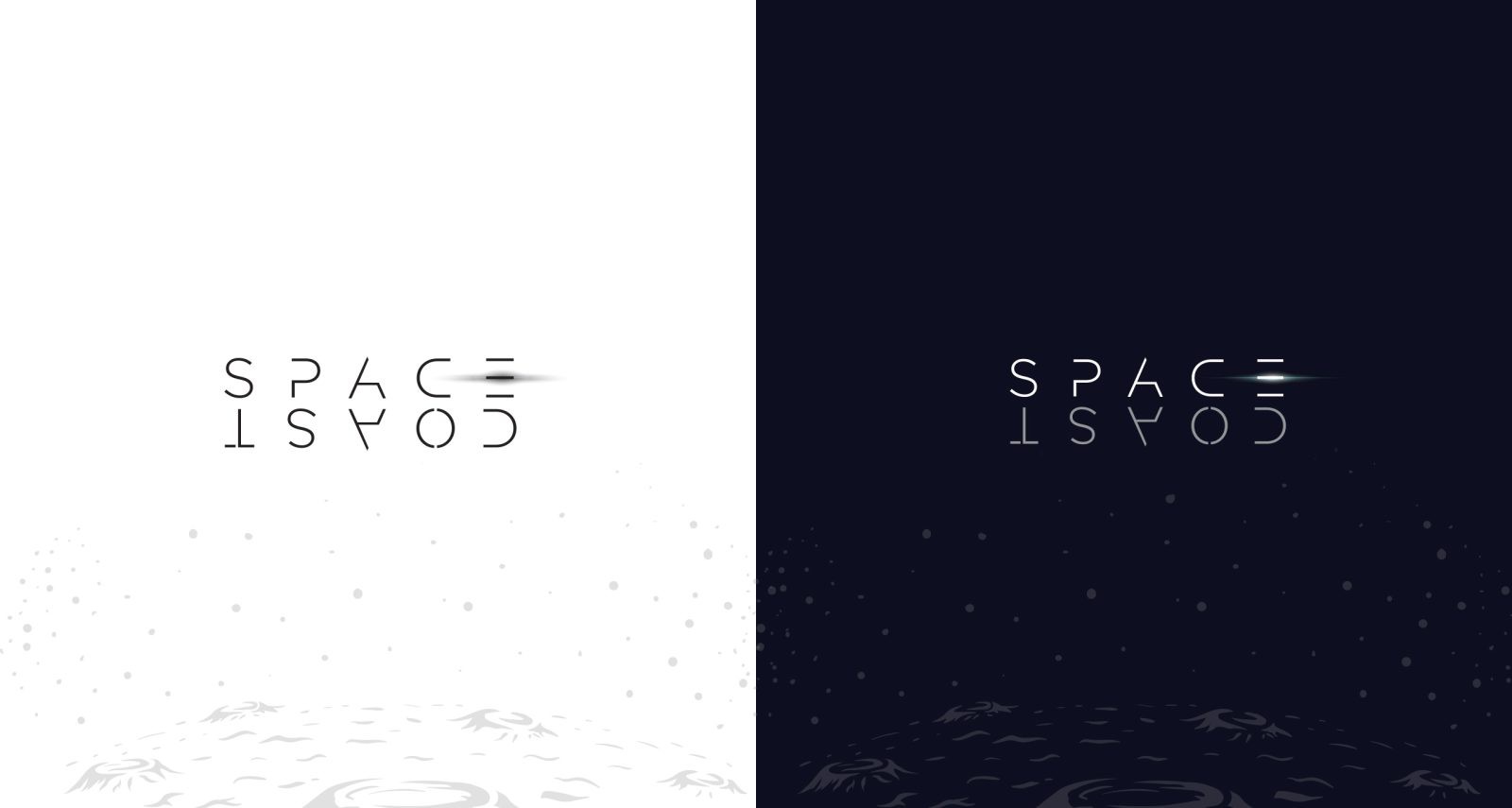
Multiple logo and branding concepts were presented, ranging from minimal and modern to more illustrative and expressive. The selected direction leaned fully into the Space Coast name, using space exploration as the foundation for the brand’s visual world.
The final identity combined futuristic typography, deep cosmic colors, astronaut illustrations, lunar textures, and subtle light effects. The logo was designed to feel sleek and contemporary, while supporting graphics gave the brand a more adventurous and collectible quality.
Brand Execution
Once the core identity was approved, we expanded the concept into a cohesive brand system that included:
- Primary and alternate logo treatments
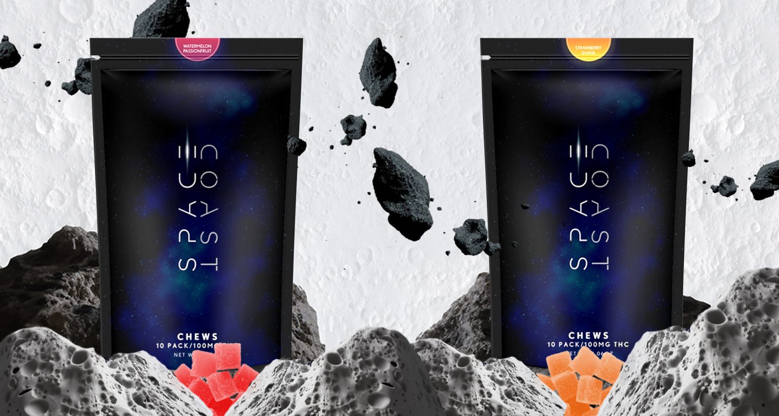
- Product packaging and flavor variations
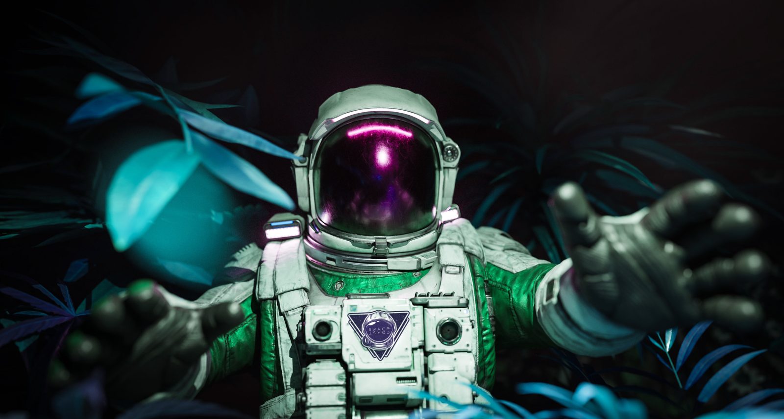
- Astronaut illustrations and branded stickers
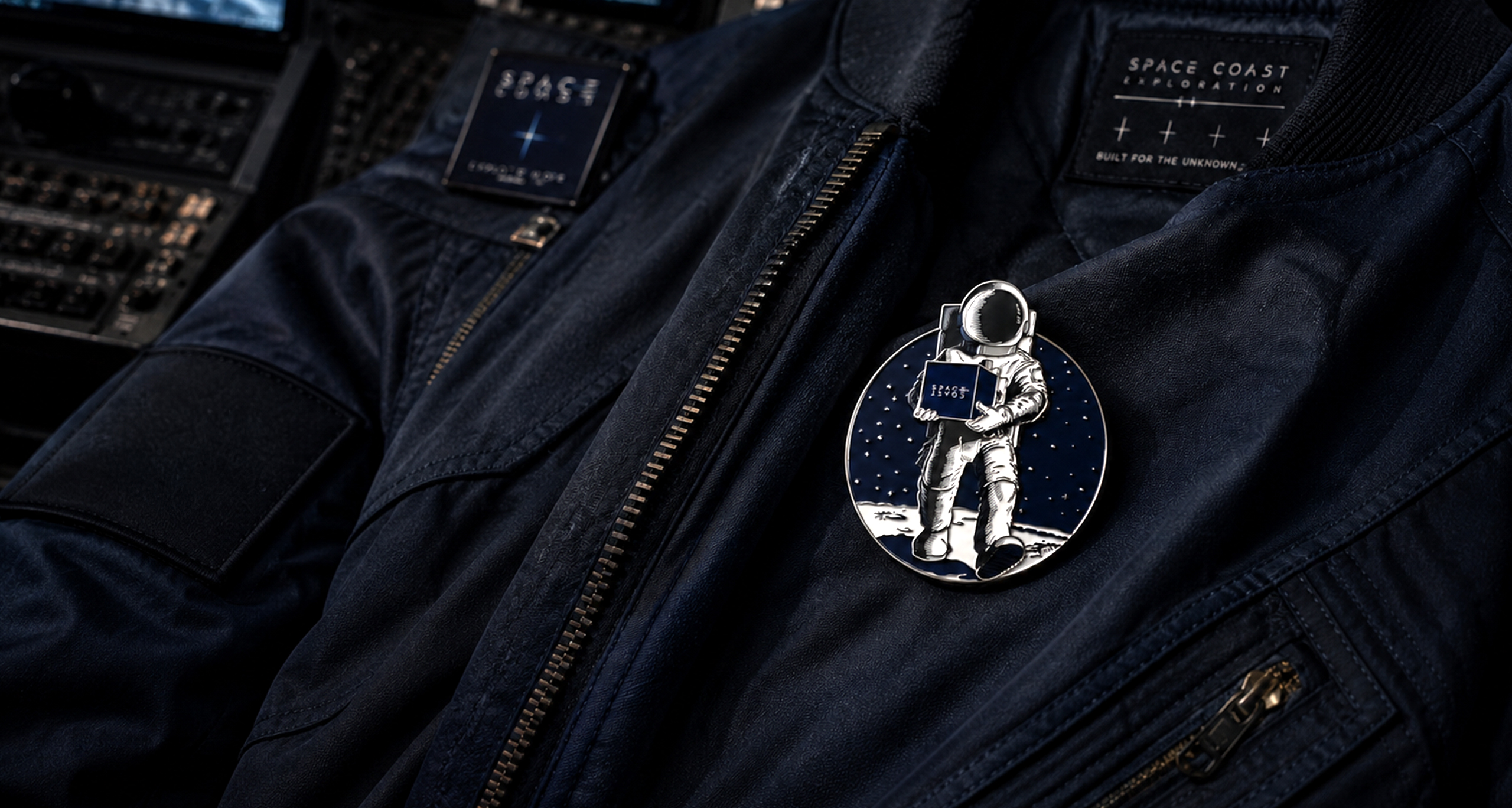
- Apparel, hats, patches, and enamel pins
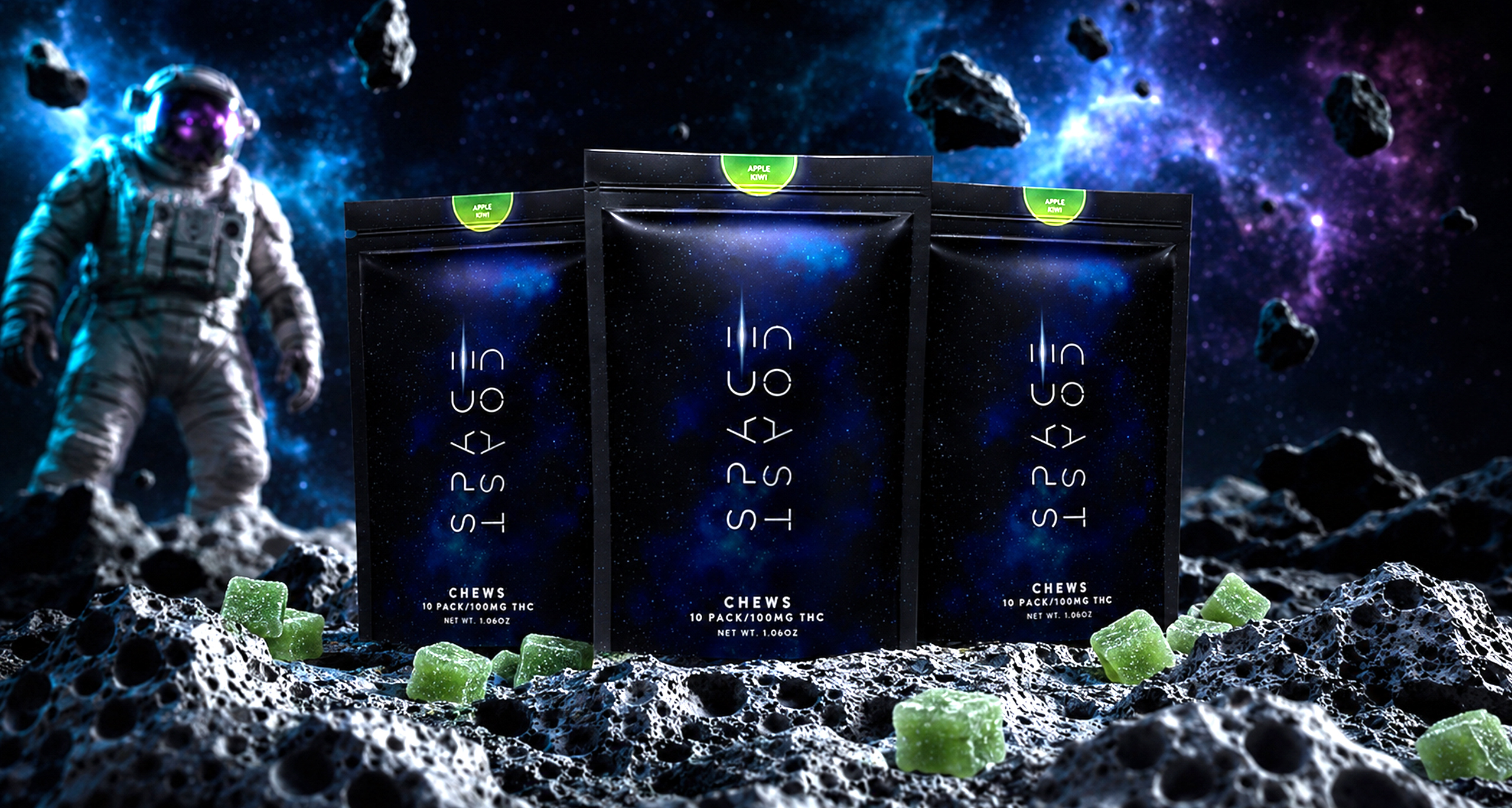
- Space-inspired product photography
- Lunar terrain and exploration-themed campaign scenes
- Branded storage cases and promotional merchandise
- Portfolio and digital campaign imagery
Each application was designed to feel like part of the same universe. Product packages were staged within cinematic lunar environments, while apparel and merchandise were presented using dramatic lighting, premium materials, and high-end editorial photography.
The Final Result
The completed identity gave Space Coast more than a logo—it created a fully developed visual world. The space exploration theme provided a strong foundation for packaging, merchandise, advertising, and future product launches while giving the brand a distinctive personality that could be recognized across every customer touchpoint.
The result was a modern, immersive brand system that feels adventurous, premium, and built for expansion.