
ZONA
ZONA blends clean, modern design with vibrant Costa Rican character to create a premium seltzer brand that feels fresh, elevated, and effortlessly tropical.
Overview
Project Overview
Zona approached us to create a complete identity for a new hard seltzer brand, including the logo, packaging, brand materials, campaign imagery, and supporting merchandise. The client was open to a wide range of creative possibilities but wanted the final brand to feel upscale, clean, and contemporary, with subtle character inspired by Costa Rica.
The Challenge
The hard seltzer category is crowded with brightly colored packaging, playful names, and similar lifestyle positioning. Zona needed a visual identity that would stand apart without feeling overly complicated or trendy.
The challenge was to create a brand that felt premium and refined while still communicating tropical energy, flavor, and a relaxed Costa Rican lifestyle.
Research & Strategy
We began with extensive category and competitive research, studying how leading hard seltzer brands used color, typography, packaging structure, photography, and flavor differentiation.
This research revealed an opportunity to move away from the louder visual conventions of the category. Instead, Zona could establish a more sophisticated position through generous white space, restrained typography, strong flavor colors, and selective tropical details.
The strategy centered on balancing three qualities:
- Premium and minimal
- Fresh and approachable
- Distinctly influenced by Costa Rica
Creative Development
Multiple visual directions were explored before arriving at the final identity system. The selected concept used a clean, geometric logo with a circular accent that could change color by flavor.
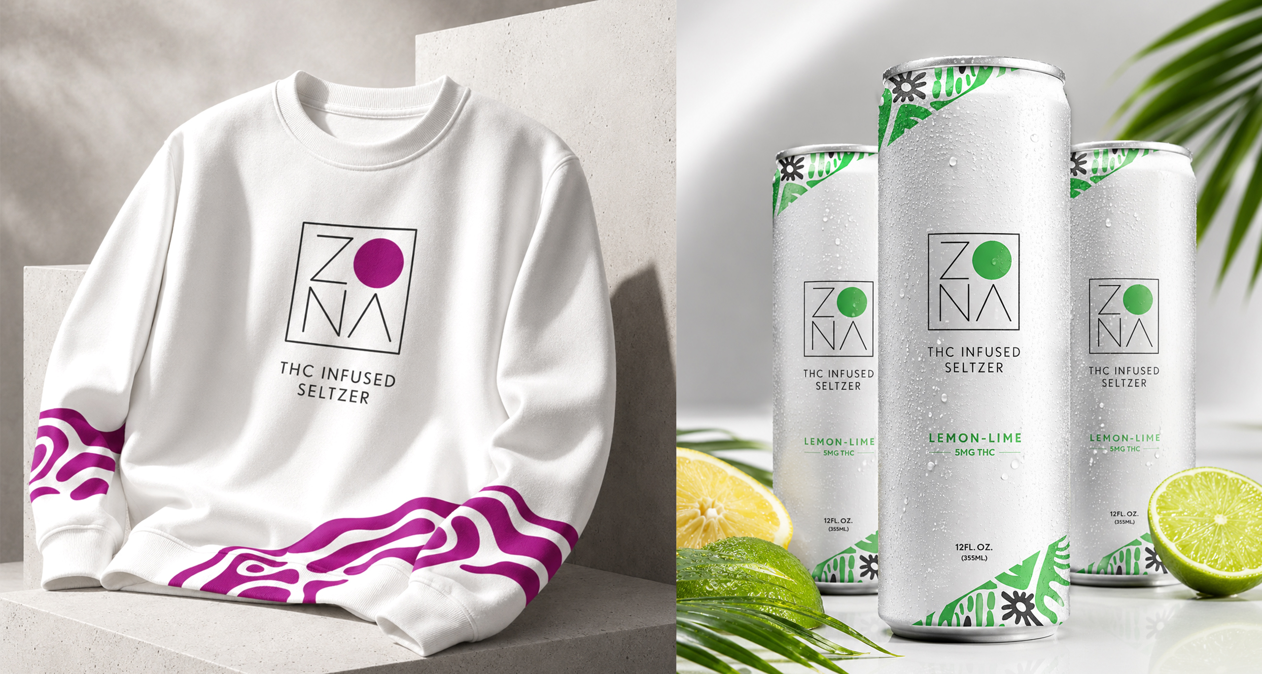
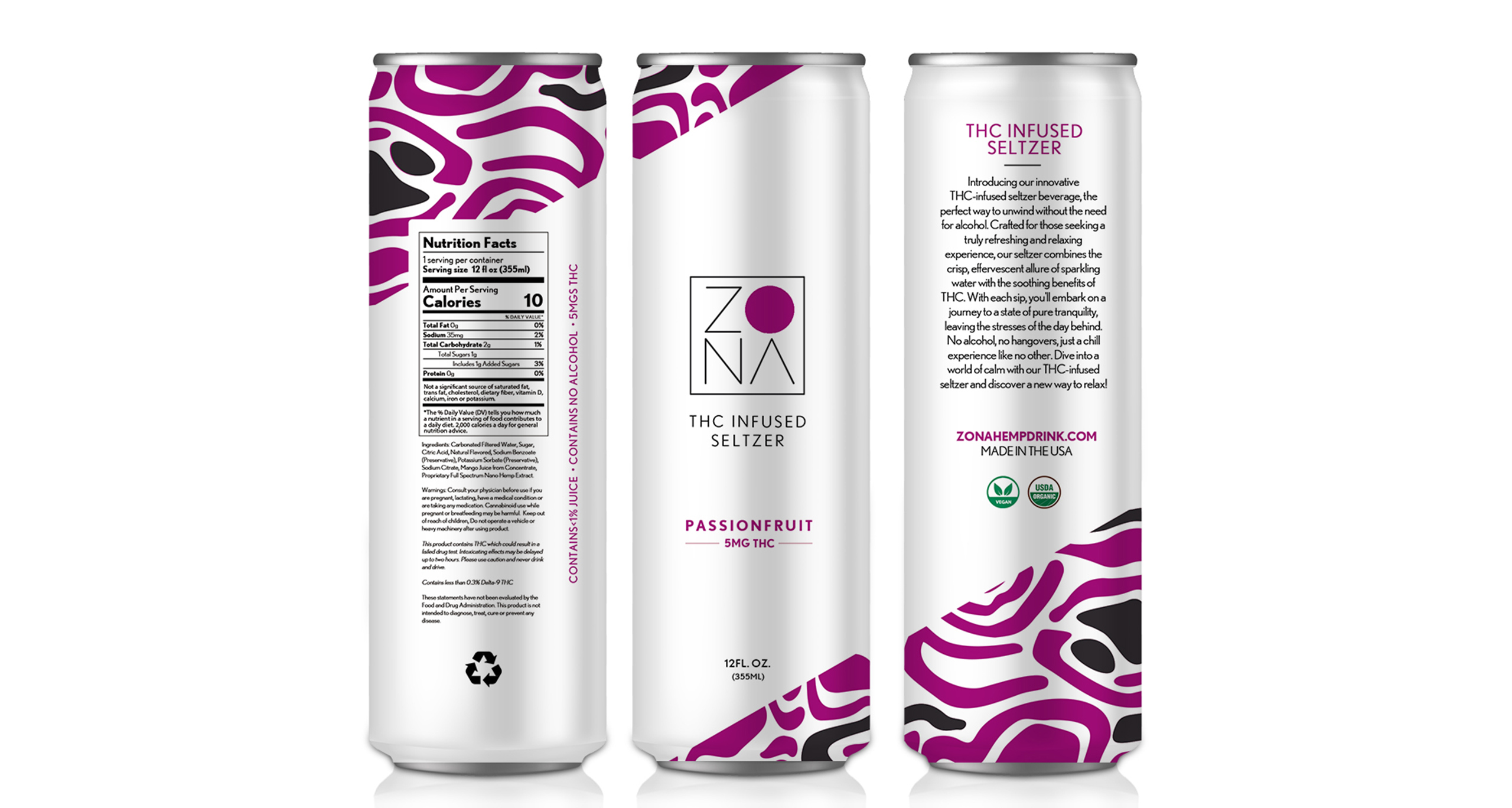
The primary packaging remained predominantly white, giving the cans a modern and elevated shelf presence. Tropical illustrations were introduced along the upper and lower edges of the can to add personality without overwhelming the design.
Each flavor received its own accent color, allowing the product line to remain cohesive while still making individual varieties easy to identify.
Packaging Execution
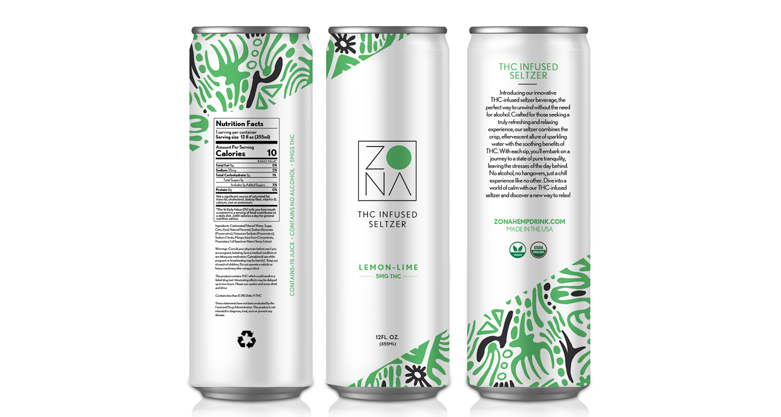
The packaging system was designed to work across the complete can, including the front-facing brand panel, flavor information, nutrition facts, ingredients, warnings, and supporting brand messaging.
The final design incorporated:
- A minimal geometric Zona logo
- Strong white space and clean typography
- Flavor-specific green and magenta accents
- Costa Rican-inspired tropical patterns
- Clear THC and product information
- A consistent structure across multiple flavors
- Premium aluminum can presentation
Brand Extension
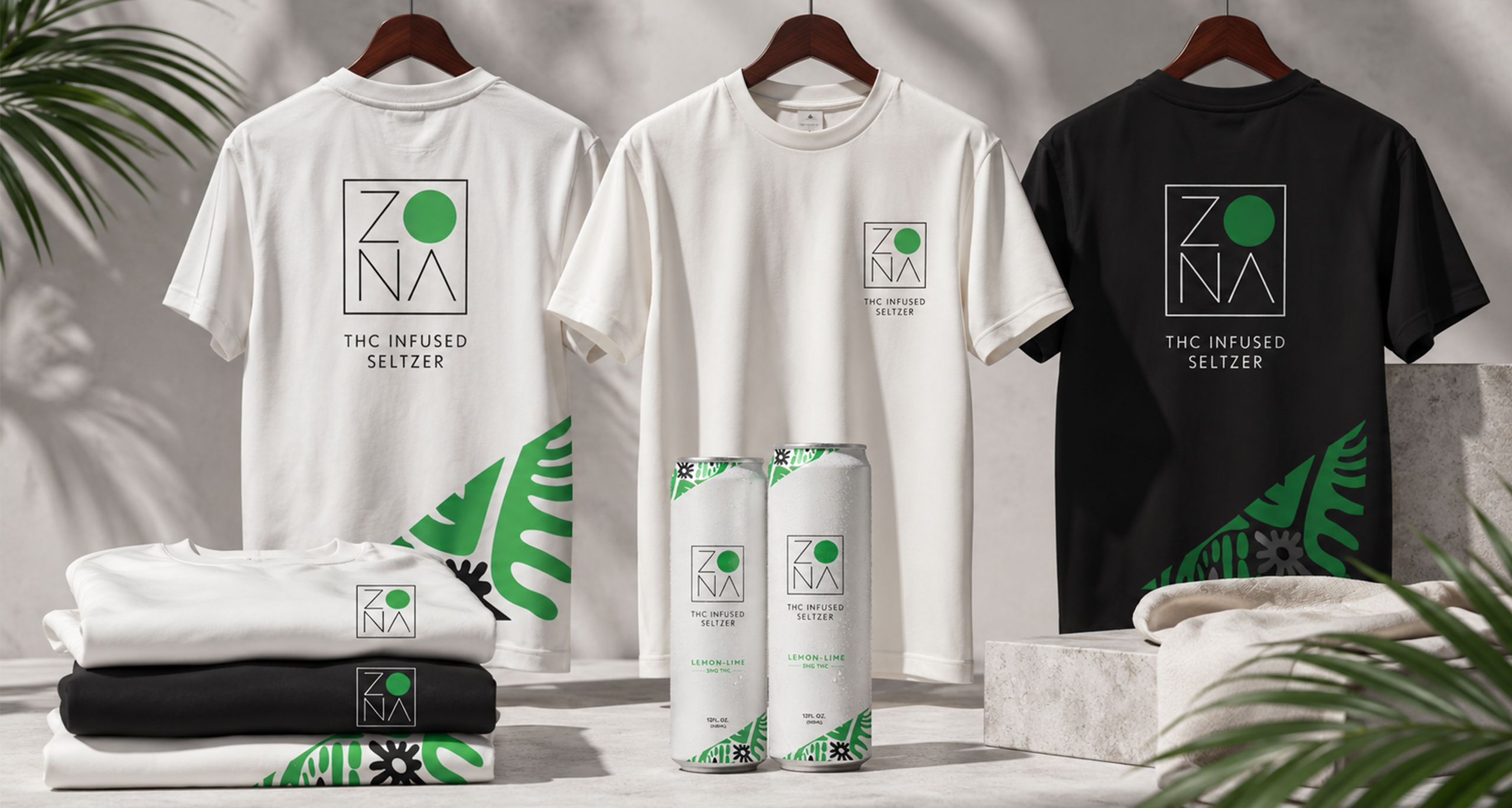
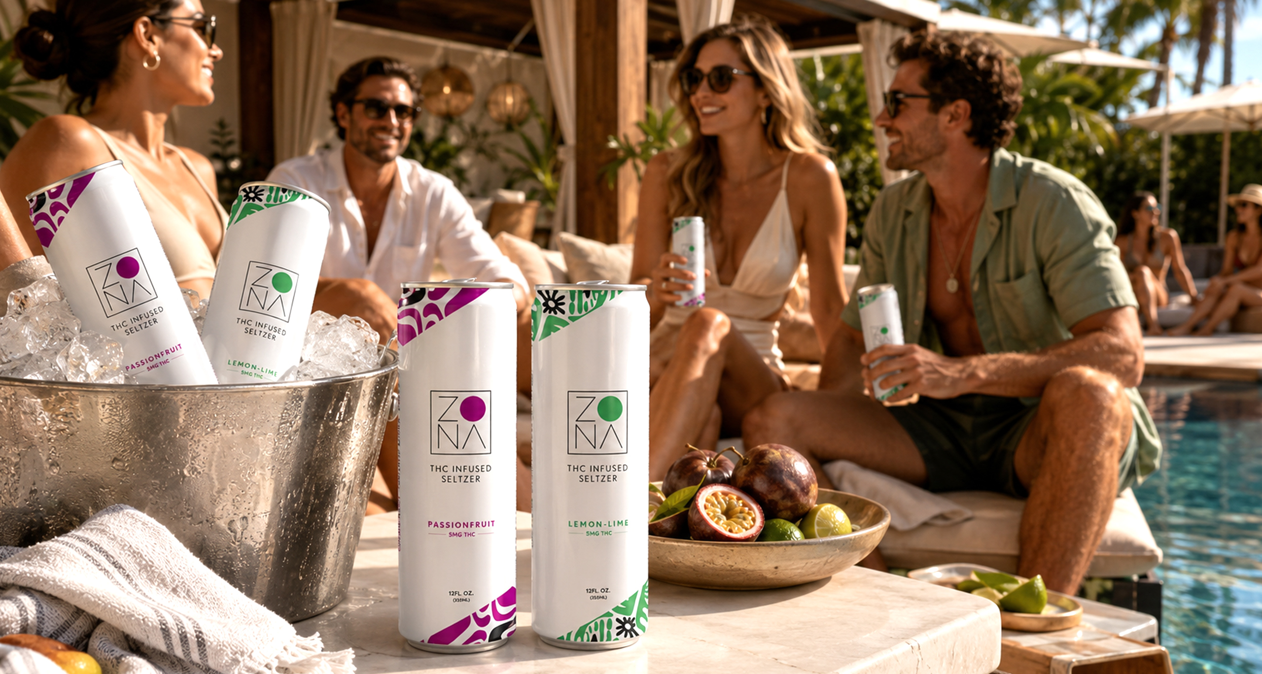
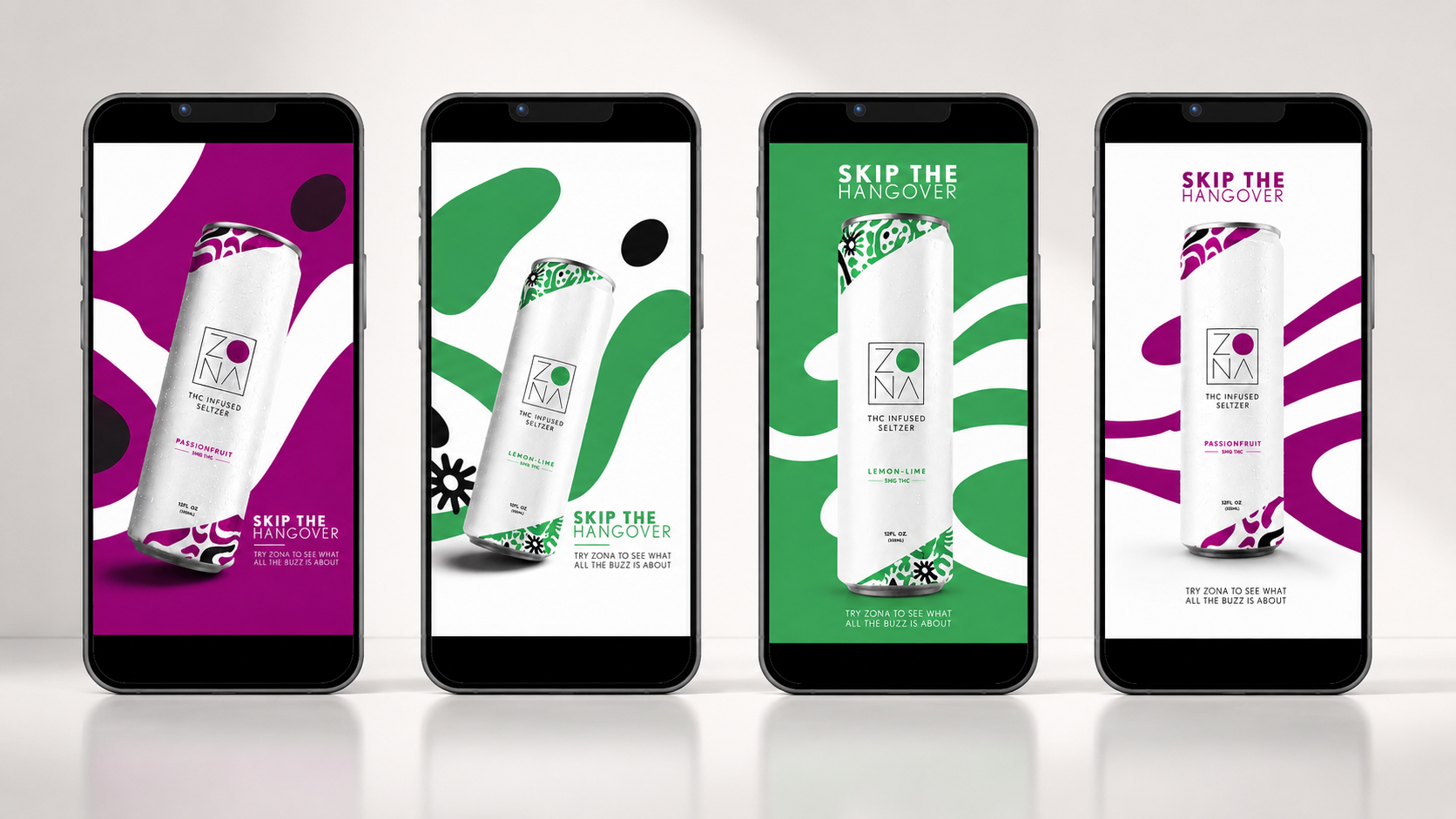
Once the core identity and packaging were established, the visual system was expanded into a broader collection of branded materials. The campaign photography paired the clean packaging with fresh fruit, tropical foliage, water, sunlight, and high-end hospitality environments. This helped position Zona as a premium lifestyle product rather than simply another canned beverage.
These included:
- Poolside and resort lifestyle scenes
- Apparel and headwear
- Tote bags and drinkware
- Social media and promotional graphics
- Multi-can product arrangements
- Flavor-focused still-life photography
- Retail and presentation mockups
The Final Result
The completed identity gave Zona a polished and recognizable presence built around simplicity, freshness and tropical sophistication.
The brand feels clean and upscale while still carrying a subtle Costa Rican influence through its lifestyle presentation. The flexible system allows Zona to introduce new flavors, products and promotional materials without losing consistency.
The result is a cohesive brand experience that feels relaxed, modern, premium and unmistakably tropical.
SERVICES PROVIDED
Branding
Marketing
Social Media Marketing
Apparel
SOCIAL MEDIA CAMPAIGN
APPAREL DESIGN